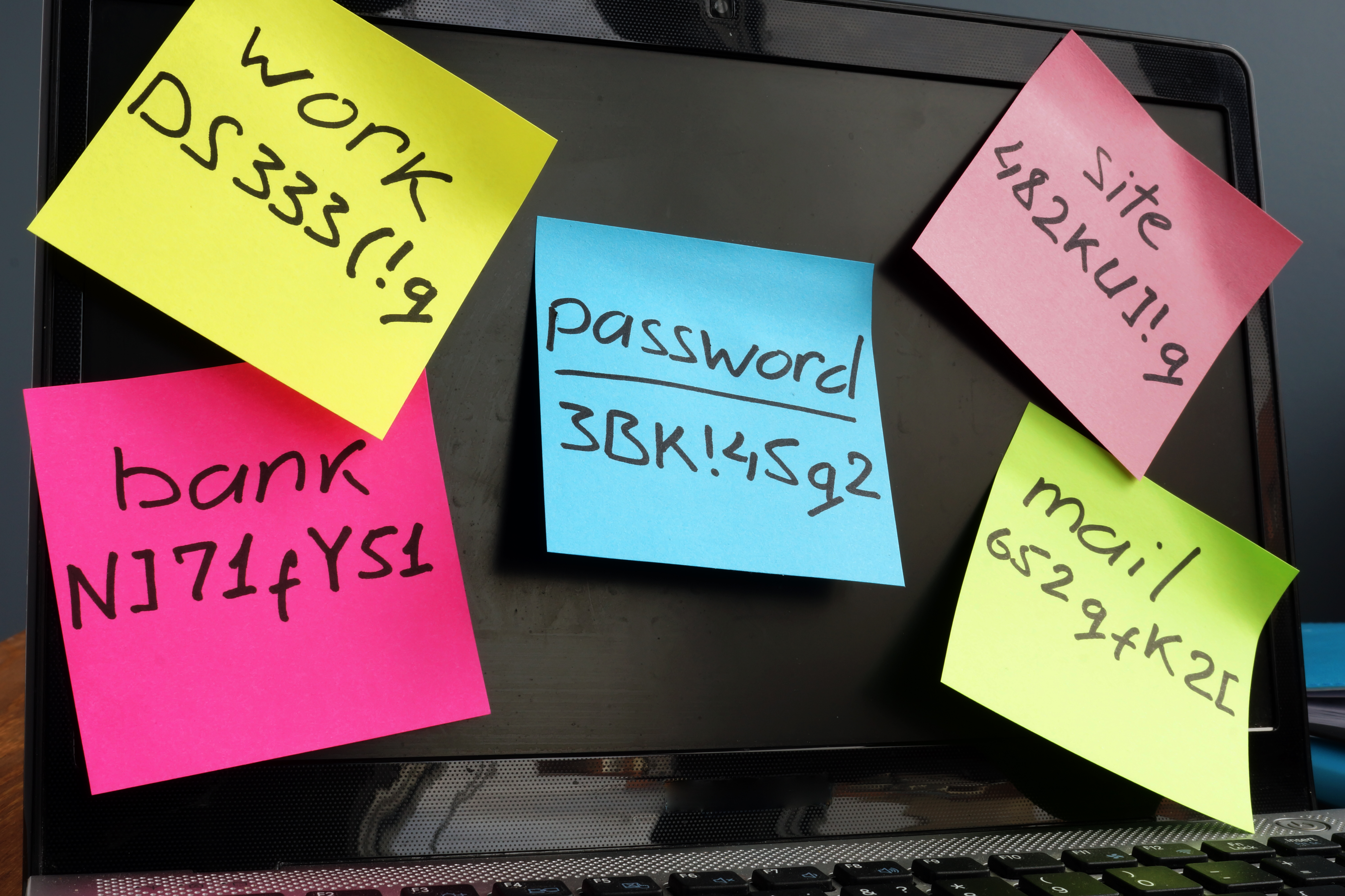
For creators of digital experiences, the log-in experience is often an after-thought, something we know happens and is usually inherited by previous designs and platforms. However, logging in is the first step for the end-user and is often a significant source of frustration. This frustration has a name—password rage.
“Password rage is what happens after a person has too much password stress/password fatigue. The user will become stress and shout, swear, and/or cry in response to password difficulties. The amount of stress that can potentially accumulate from constant password problems can be very high since these passwords are the key to your digital life (bank, credit, communications, etc.).” – Gate Keeper, 2021
Below are a few best practices the Usability Sciences Research Team has collected from participants and clients to help you address the issues that cause password rage.
#1 - Provide the option to ‘Show Password’ during creation, updating, and entering
People “fat-finger” things all the time. They also forget what they’ve entered. They need to see the password to know what has been entered and correct mistakes.
#2 - Display password rules for creating or changing passwords
Your customers and end-users are on multiple sites and apps a day, each with their own login experience and requirements. By displaying the password rules, you help users create stronger passwords or variations of their strongest passwords.
#3 - Suggest ways to create unique passwords
If it were up to the human in your experience, they would use the same password for everything; however, we all know doing so is unsafe and highly frowned upon. By recommending ways to improve their password creation methods, you help them create stronger, more UNIQUE passwords for your experience.
Examples, courtesy of BeCyberSafe.com:
- Choose 4 random words
- Entire Phrases
- Passphrase acronyms
- Intentional Misspellings
#4 - Show password strength
The user will start with something easy to remember, and sometimes their choices are extremely weak, like 123456. When prompted with password strength and implied relevance to overall safety, users often create better passwords.
#5 - Display the number of attempts allowed BEFORE lockout
Being locked out is the worst! By letting them know they will run out of attempts, users have the opportunity to change their passwords to avoid the hassle proactively.
#6 - Provide QUICK recovery options
Your user WILL FORGET their passwords. A few good recovery options we've seen include:
- Display a password hint.
- List the password requirements to jog the memory.
- Send a password recovery code to their phone via call or text.
- Allow them to answer security questions.
#7 – Display ‘Email last changed’ date
Users often enter old passwords out of habit and forgetfulness. It helps when sites like Google say 'password was changed 4 months ago to help jog their memory.
Obviously, security is a major concern for everyone, but so is productivity. Let's do our part to make these experiences both SECURE and USER-FRIENDLY. If you're not sure if your experience is both, it may be time for a quick usability test. Contact us to learn more about our capabilities and pricing.
Other Password Related Reads:
- What’s The Best Way To Remember Passwords? 59% Of People Get This Wrong, Forbes
- Part 1: Usability Is Security, Duo
- Empirical Analysis on the Usability of Passwords, California State University
- 14 Great Password Ideas, ByCyberSafe.com
Adrienne Guillory is an expert in Human-Centered Design, Design Thinking strategy, facilitation, and generative User Experience research. As the COO for Usability Sciences, Adrienne manages the recruiting and research teams that provide actionable insights for digital experiences through exploratory and evaluative research methods. In her free time, Adrienne is a mentor, career coach, and Program Director for Dallas Black UX, a networking and mentoring organization for UX professionals of color.
